• Design • 2 min read • 3 comments
Pagination directions
Although pagination is a widely diffused pattern, some times it can still be a bit confusing, when it comes to blogs.
Most blogs (and many news sites) have a couple of links at the bottom of the page, newer and older posts or articles. Of course, there are two opposite ways to arrange those links: put the newer link on the left and the older one on the right, or just the opposite. What I consider to be annoying (and confusing), is to find both alternatives used inconsistently across blogs and websites.
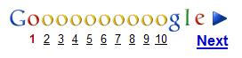
For example, the Google Blog puts the Newer Posts link on the left,

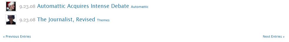
while Worpress places Newer Entries » on the right
Confusing, isn’t it? What is the right way to show those links?
Pagination by itself is quite clear: most web users have long become accustomed to Google search results pagination,
and Yahoo’s Design Patter Library states it clearly:
- Present links in the following order: ‘Prev’, page links, ‘Next’.
- Display a left arrow after the label ‘Prev’.
- Display a right arrow before the label ‘Next’.
In other words, previous goes to the left, while next goes to the right.
The problem with blogs and articles is that it’s not clear what should we consider the “previous page”.
Is it the one with the older (previous) posts? Or, since articles are listed starting from the more recent ones, the page with the more recent posts?
I think any answer would be debatable, and that’s the source of all the confusion. What would you say?
Comments
I am not that much into blogging, so i never put much thought into this issue, still, i noticed something like that in forums, and i remember it was a bit unnerving, although it was about threads and not articles.
From my point of view, using a navigation studied (and applied as a standard) for objectively ordered lists, such as google's search page, is just plainly wrong. If i were to design navigation controls for anything which hasn't a clear order (or has any form of order which could depend from the person using it) i'd either put them in a column (meaning, one below the other) or in a completely different page section, and let a couple of well-chosen icons take care of user-friendliness.
Very interesting this post.
Wordpress puts the "Older posts" on the left, but Blogger (blogspost.com) on the right... also the major make great confusion
It appears to be a common issue when it comes to paging items by "recency". You can see another ambiguous example if you go to the messages section of your facebook profile. Notice the two tiny arrows on the top of the page: which one brings you to the newer message?
Gmail uses full text links (Newer/Older) rather than tiny obscure icons, but it can still be confusing.
I was wondering, however, about Dario's proposal: even it we put navigation controls in a column, we'd still have to sort them. Which entries should go on the top?
I'm afraid I'm missing the point here.